
seabornはmatplotlibをベースにしたデータビジュアライゼーションライブラリです。countplot はカテゴリカルデータを集計から度数分布図までを一気に実行してくれる大変便利なツールです。
本サイトでも何度か、データビジュアライゼーションのサンプルとしてseaborn をcode を紹介してきましたが、今回は度数分布を作成するcountplot での annotation(度数) のつけ方について解説します。
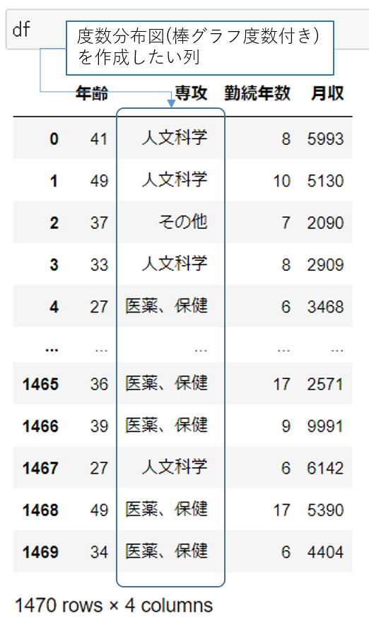
サンプルデータセット
日本語化した度数分布表を作成するため、
サンプルデータセットで紹介しているデータセット3 のHRデータを編集して使っています。HRデータのうち、Age, EducationField, TotalWorkingYears MonthlyIncome の列をそれぞれ、「年齢」、「専攻」、「勤続年数」、「月収」と書き換えました。 さらに、EducationFieldで含まれるカテゴリカルデータを日本語にしています。
1
2
3
4
5
6
7
8
9
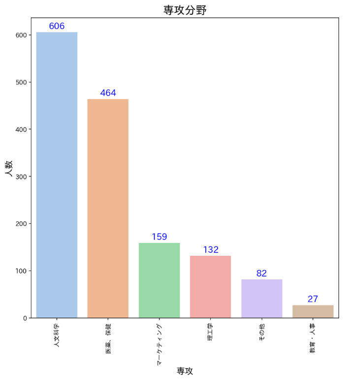
df['専攻'].value_counts()
>>人文科学 606
>>医薬、保健 464
>>マーケティング 159
>>理工学 132
>>その他 82
>>教育・人事 27
>>Name: 専攻, dtype: int64
Python コードの紹介
1
2
3
4
5
6
7
8
9
10
11
12
13
14
15
16
17
18
19
20
21
22
23
24
25
26
27
28
29
30
31
32
33
34
35
36
37
38
39
40
41
42
43
44
import numpy as np
import pandas as pd
import seaborn as sns
#matplotlibのグラフをRetinaの高解像度で表示する
%config InlineBackend.figure_formats = {'png', 'retina'}
#Jupyter Notebookの中で作図した画像を表示させる
%matplotlib inline
#matplotlib をインポートする
import matplotlib.pyplot as plt

#日本語タイトルのため、japanizeをインポートする
import japanize_matplotlib
plt.rcParams['font.family'] = 'IPAexGothic'

#タイトル名等の変数の定義
title = '専攻分野'
col_name = '専攻'
y_label = '人数'

#figsizeを9inch by 9inch とする
plt.subplots(figsize =(9,9))
#seaborn countplotを設定し、変数axとしてAnnotationを上書できるようにする
ax = sns.countplot(x = col_name,
                   data = df,
                   palette='pastel',
                   order = df[col_name].value_counts().index)

#グラフタイトル、軸名を設定する
plt.title(title, fontsize=18, fontweight='bold' )
plt.xticks(rotation=90)
plt.xlabel(col_name, fontsize = 14, fontweight='bold')
plt.ylabel(y_label, fontsize = 14, fontweight='bold')

#Annotation を設定する
for p in ax.patches:
    ax.annotate(format(p.get_height(), '.0f'),
                   (p.get_x() + p.get_width() / 2.,
                    p.get_height()),
                    ha = 'center',
                    va = 'center',
                    xytext = (0, 9),
                    textcoords = 'offset points',
                    fontsize = 14,
                    color = 'blue')
小数点何位までの表示とするかの指定
数字表記の肝心な点として小数点何位まで表記するかだと思います。 度数ですので、この表では整数=小数点は無いようにコントロールしています。 その指定は以下のformat( '0f')の部分がそれに相当します。
- format(p.get_height(), '.0f'
- 値pの小数点以下何位まで表記かを指定する .0f = 小数点は無い
度数分布図、大きい順
line 26 で order = df[col_name].value_counts().indexの指定があるため、度数の多い順に並べて棒グラフが完成します。 イメージは以下のとおりです。
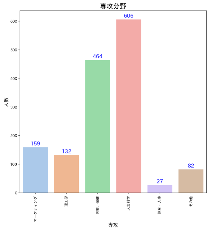
度数分布図、任意のカテゴリー順
order = ['マーケティング', '理工学', '医薬、保健','人文科学','教育・人事','その他']として
order = orderとすると、orderで指定した順に棒グラフが並びます。イメージは以下のとおりです。
line 10に注目してください。
1
2
3
4
5
6
7
8
9
10
11
12
13
14
15
16
17
18
19
20
21
22
23
24
25
26
27
order = ['マーケティング', '理工学', '医薬、保健','人文科学','教育・人事','その他']
title = '専攻分野'
col_name = '専攻'
y_label = '人数'

plt.subplots(figsize =(9,9))
ax = sns.countplot(x = col_name,
                   data = df,
                   palette='pastel',
                   order = order)

plt.title(title, fontsize=18, fontweight='bold' )
plt.xticks(rotation=90)
plt.xlabel(col_name, fontsize = 14, fontweight='bold')
plt.ylabel(y_label, fontsize = 14, fontweight='bold')

#Annotation を設定する
for p in ax.patches:
    ax.annotate(format(p.get_height(), '.0f'),
                   (p.get_x() + p.get_width() / 2.,
                    p.get_height()),
                    ha = 'center',
                    va = 'center',
                    xytext = (0, 9),
                    textcoords = 'offset points',
                    fontsize = 14,
                    color = 'blue')
参照ページ一覧
本ブログは、以下のネットの記事等を参考に作成しました。
1) seaborn
2) matplotlib
3) EXCELの達人からPythonの達人へ:住民基本台帳年齢階級別人口から都道府県別人口を作成する
4) 日本語対応した matplotlib 2軸グラフ